
Style guide
One look for every jor.dev project. The minimal layout, Montserrat and the text colors come from the resume, the accent colors come from the PS Battery icon.
Principles
- Minimal. Whitespace does the layout work. Hairline borders, one soft shadow, no gradients, no decoration that does not carry meaning.
- Color is sparse. Pages are ink on paper, or light text on near black. Turquoise marks what is interactive, pink is the dot and the occasional secondary accent, yellow appears rarely as a highlight.
- Type does the talking. Bold sentence case headings, small airy body text, four weights of one typeface. A title starts with one capital letter and that is it: never all caps, never title case.
- Dark mode everywhere, following the system setting. The one exception is the resume, which is an A4 sheet and always stays light.
- Accessible. WCAG AA contrast in both modes, visible focus rings, never color alone to convey meaning.
Logo
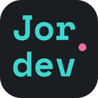
The mark is Jor over dev in Space Mono Bold, all turquoise, with the pink dot from jor.dev sitting between the lines. The wordmark is the same thing on one line: Jor in turquoise, a pink period, dev in the text color.
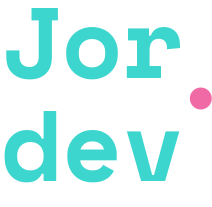 mark.svg
 icon.svg
 mark-mono.svg (currentColor)
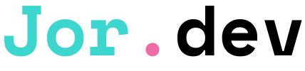 wordmark.svg
Icon at small sizes


Rules
- Use
icon.svgand the PNGs inlogo/png/for favicons and app icons. The dark tile keeps the mark readable on any background. - Use
mark.svgon dark surfaces and on light surfaces where it is decorative. For a mark that must carry contrast on light, usemark-mono.svgin ink. - Use the wordmark in headers and footers. Its dev takes the page text color, so it fits light and dark.
- Keep clear space around the logo equal to the height of the pink dot.
- Do not recolor the dot, move it, rotate the mark, add outlines or shadows, or set the logo in another typeface. The logo is always Space Mono Bold with a capital J.
- Rebuild with
npm run build:logosandnpm run export:pngwhen something changes.
Colors
Turquoise is primary, pink is secondary, yellow is for highlights only. The bright brand tones are fills. For text on light backgrounds use the 700 tones, in dark mode the bright tones are the text colors. Text itself is the resume ink, and ink at 75 percent for secondary text.
Contrast (WCAG AA needs 4.5:1 for text)
| Foreground | Background | Ratio | Use |
|---|---|---|---|
| Turquoise 700 | Paper | 4.67 | Links and primary text, light mode |
| Pink 700 | Paper | 4.55 | Secondary text, light mode |
| Ink | Paper | 16.60 | Body text, light mode |
| Muted light | Paper | 7.74 | Muted text, light mode |
| Turquoise | Dark background | 10.30 | Links and primary text, dark mode |
| Pink | Dark background | 6.42 | Secondary text, dark mode |
| Muted dark | Charcoal | 7.85 | Muted text on dark cards |
| Ink | Turquoise | 10.28 | Text on primary buttons |
| Ink | Pink | 6.41 | Text on secondary buttons |
| Ink | Yellow | 12.23 | Text on highlight badges |
| Turquoise | White | 1.79 | Never as text on light |
| Pink | White | 2.87 | Never as text on light |
| Yellow | White | 1.51 | Never as text on light |
Typography
Montserrat in four weights, self hosted. Headings are bold and in sentence case, body text is small and airy. Keep lines under 65 characters. Space Mono, the logo typeface, is the monospace font for code.
A team oriented developer, always available to help with or answer any questions. I also love diving into complex problems and finding a practical solution for the team to use.
Smaller supporting text, like the contact lines and skills on the resume. Generous line height keeps it readable.
npm run build:logos
Spacing and shape
A 0.25rem spacing scale. Corners are barely rounded on cards and inputs, fully rounded on buttons and badges, and 22 percent on the app icon.
Components
Small set of classes from base.css. Enough for the tools and game pages, nothing more.
Card
White surface on paper in light mode, charcoal on near black in dark mode. A hairline border and the soft resume shadow.
Use in a project
Run sh scripts/install.sh <project>, which copies the tokens, base styles, fonts and logos into the project under brand/ and the favicons to its root. Then link them before the project stylesheet and style with the semantic variables. Dark mode comes for free. A page that must stay light, like the resume, puts data-theme="light" on the html element.
<link rel="preload" href="./brand/fonts/Montserrat-Regular.woff2" as="font" type="font/woff2" crossorigin />
<link rel="preload" href="./brand/fonts/Montserrat-Bold.woff2" as="font" type="font/woff2" crossorigin />
<link rel="preload" href="./brand/fonts/SpaceMono-Bold.ttf" as="font" type="font/ttf" crossorigin />
<link rel="stylesheet" href="./brand/tokens.css" />
<link rel="stylesheet" href="./brand/base.css" />
<link rel="stylesheet" href="./style.css" />
<link rel="icon" type="image/svg+xml" href="./favicon.svg" />
<link rel="apple-touch-icon" sizes="180x180" href="./apple-touch-icon.png" />